A12 Plasma – The Design System for Complex Business Use Cases
Accessibility at the Highest Level
Target group

Guidelines and Laws
- EU Guideline 2016/2102 about web accessibility
- BIK BITV-Test (BITV 2.0)
- EN 301 549 – Accessibility requirements for IKT- products and services
- WCAG – Web Content Accessibility Guidelines (WCAG 2.1)
Optimized accessibility through continuous testing

Shaping corporate identity with Plasma
The optimal Design System for your application!
Visually Appealing complexity
Components
Effective forms
For a digital form input to be effective, it should use the appropriate input type, have clear labels, and provide helpful placeholders. Responsive design ensures usability across devices, while accessible attributes enhance inclusivity. Providing clear feedback on errors or success further improves the user experience.
Semantic Behaviour
Semantic behavior of form inputs refers to using specific HTML input types (e.g. email, date) to convey meaning and improve accessibility, validation, and user experience. This ensures forms are intuitive and efficient.
Suffixes
Suffixes in inputs enhance clarity by indicating the expected format, such as “@domain.com” for emails or “.jpg” for file uploads. They aid in validation, reduce errors, and improve user experience, while also providing cues for accessibility tools like screen readers.
Screenreader
To ensure accessibility for visually impaired users, input fields should use semantic HTML and clear labels with the <label> tag. Descriptive placeholders and ARIA attributes enhance context, while error messages should be readable by screen readers. This thoughtful design allows all users to interact confidently with forms.
Responsive Form
For an input to be effective in a responsive form, it must:
-
Adapt Layout: Resize and reposition according to different screen sizes, maintaining usability.
-
Touch-Friendly: Be large enough for touch interactions on mobile devices.
-
Flexible Width: Use percentage-based widths to fit various screen dimensions.
-
Clear Labels: Display clear labels that remain visible across all devices.
-
Accessible: Include attributes that support assistive technologies for all users.These elements ensure a seamless user experience across devices.
States & Contrast
The contrast of chosen colors for different states in user interface elements is crucial for usability and accessibility. Here are key considerations:
-
Default State: The color should be easily readable against the background, ensuring sufficient contrast (ideally a ratio of at least 4.5:1 for normal text).
-
Hover State: The hover color should contrast well with the default state to indicate interactivity, usually through a lighter or darker shade.
-
Focus State: The focus color should be distinct, often using outlines or a change in background color to help keyboard users navigate.
-
Disabled State: The disabled color should indicate unavailability but remain visible, often using muted shades while maintaining some contrast.
-
Error State: Error colors (typically red) should stand out against the background, signaling issues clearly without causing confusion.
Add-ons
Add-ons in input fields enhance functionality and user experience by providing additional features. Here are some common types of add-ons:
-
Icons: Placing icons within or next to input fields (e.g. a search icon or a calendar for date pickers) helps users understand the input's purpose.
-
Tooltips: Adding tooltips that appear on hover or focus can offer additional information or guidance about what the input requires.
-
Auto-complete: This feature suggests options as the user types, speeding up data entry and reducing errors.
-
Validation Messages: Real-time feedback on input validity (e.g. showing a checkmark or an error message) helps users correct mistakes instantly.
-
Dropdowns: Integrating dropdowns with input fields allows users to select from predefined options, making data entry more efficient.
-
Clear Buttons: A button to clear the input field can enhance usability, especially in search or filter scenarios.
These add-ons make forms more interactive and intuitive, ultimately improving the user experience.
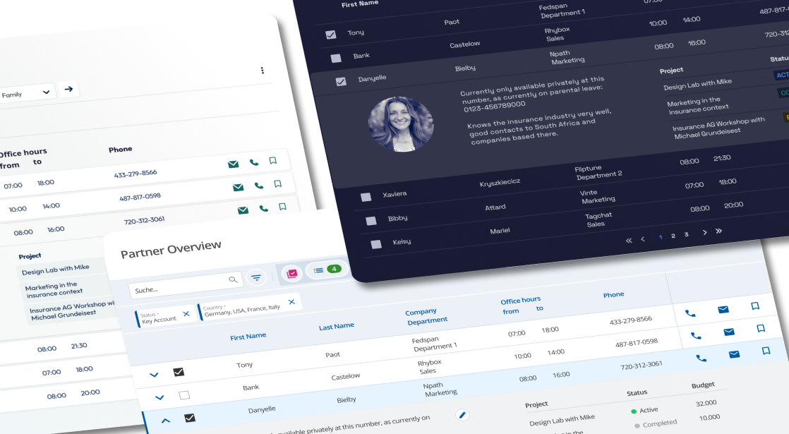
- Search
- Resizable columns
- Summary rows
- Customizable Actions
- Filter
- Paging or Infinite Scrolling
- Expandable rows
- Multiselect
- Sorting
- Column Grouping
Business Processes & Rolespecific Tasks
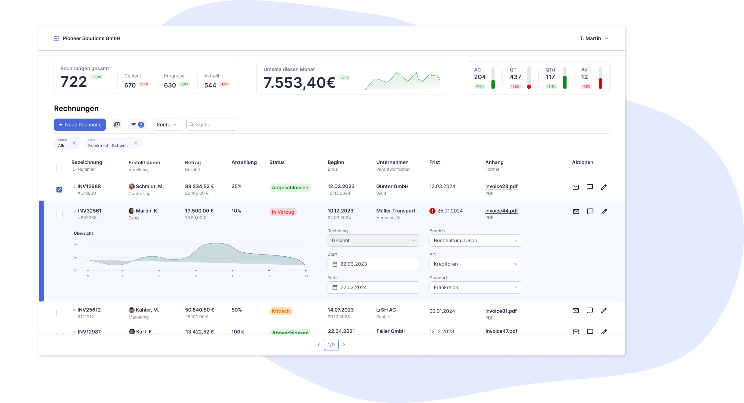
- Working with Tables
- Creating Business Objects
- Editing Business Objects
- Workflows and Status
- Validation
- Notifications
- Navigation
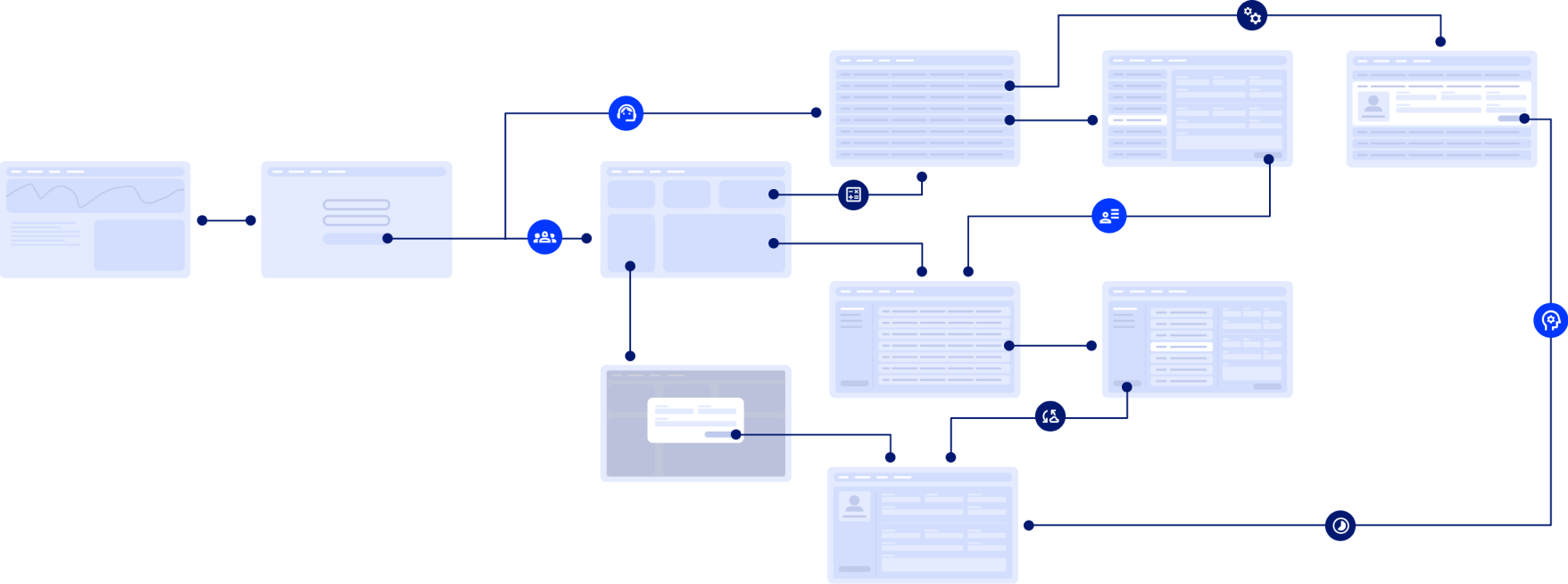
The constant evolution of our design system
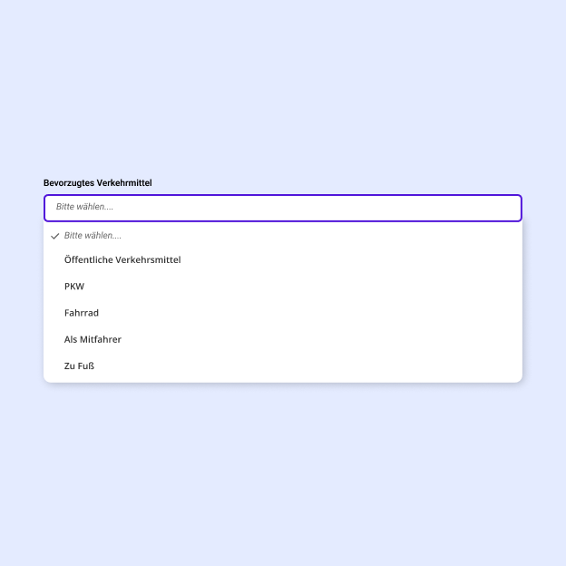
1. Select
An option can be selected from a drop-down list.
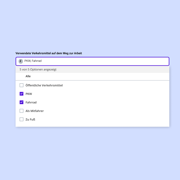
2. Multiselect
One or more options can be searched for and selected from a drop-down list.
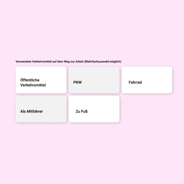
3. Expanded Select
One or more options can be selected from directly visible selection elements.
